


Gráfico del Diseño Internacional
1997–2000
Revista Matiz
Diseñador de la revista MATIZ Gráfico del Diseño Internacional, en sus versiones impresa y online. Tuve el honor y gusto de diseñar en 18 de sus 20 ediciones.
A nível personal Matiz fué un gran laboratorio de ideas cuyo punto central era la experimentación. Logró transmitir un mensaje poderoso en el mundo del diseño gráfico, nos permitió desafiar las convenciones y explorar nuevas posibilidades. Nos sumergimos en un mar de conceptos e ideas, donde la tipografía, el color, la composición y los elementos gráficos cotidianos se conviertieron en herramientas para contar historias y despertar emociones.
Al lado de un gran equipo de diseñadores encabezado por Domingo Martínez, Francisco Estrella, Manuel Guerrero, Gabriela Guzmán Zanabria, Nacho Peón, Mónica Peón, Paco Hernández, Sara Luna, Griselda Ojeda, la Veronique, Cristina García, Claire Castillo, Gabriel Rivera y la inversión de Alvaro Rego creamos una nueva forma de arte que invito a romper las reglas, desafiar los límites y explorar nuevas formas de comunicación visual en nuestro país.
Designer of MATIZ magazine in its printed and online versions. I had the honor and pleasure of designing 18 of its 20 editions.
On a personal level Matiz was a great laboratory of ideas whose central point was experimentation. I managed to convey a powerful message in the world of graphic design, allowing us to challenge conventions and explore new possibilities. We immersed ourselves in a sea of concepts and ideas, where typography, color, composition and everyday graphic elements became tools to tell stories and awaken emotions. Together with a great team of designers we created a new form of art that invites us to break the rules, challenge the limits and explore new forms of visual communication in our country.

• MATIZ ÍNDICE Spread del número 17 de la revista Matiz. Bloques inspirados en piezas de juguetes TENTE de los años 80’s. • INDEX Spread of Matiz magazine number seventeen. Blocks inspired by TENTE toy pieces from the 80's.

• DIRECTORIO El tema de la revista número 17 fué llamada “Vínculos Sudámerica”, en la que aproveche para generar una tipografía nueva y experimentar con formas y fondos orgánicos. • DIRECTORY The theme of the magazine number 17 was called “South American Links”, in which I took the opportunity to generate a new typography and experiment with organic shapes and backgrounds.

• SENSACIONAL DE ILUSTRADORES Artículo sobre el ilustrador Ricardo Pelaéz. • SENSATIONAL OF ILLUSTRATORS Article about the illustrator Ricardo Pelaéz.

• PÁGINAS IRREVERENTES Artículo de Gabriel Sama acerca de los proyectos editoriales independientes que terminan en el matadero. Fué muy divertido meter un empaque de carne del Superama de la esquina al scanner AGFA de miles de dólares. • IRREVERENT PAGES Article by Gabriel Sama about independent publishing projects that end up in the slaughterhouse. It was a lot of fun to put a package of meat from the Shopping store of the neighborhood into the AGFA scanner worth thousands of dollars.


Spread from Matiz, number eight. Article, Irreverent Pages, by Gabriel Sama, proudly was selected for Communication Arts #303 March/April 2001 in special issue of Mexican Design.
Este spread fué publicado colectivamente por la revista internacional Communication Arts en número especial de Diseño Mexicano.

• SEÑAS PARTICULARES E IDENTIDADES CORPORATIVAS Artículo sobre el proceso creativo de estudio Kimera de Gabriel Martinez Meave. • PARTICULAR SIGNS AND CORPORATE IDENTITIES Article about the creative process of Mexican design studio Kimera.
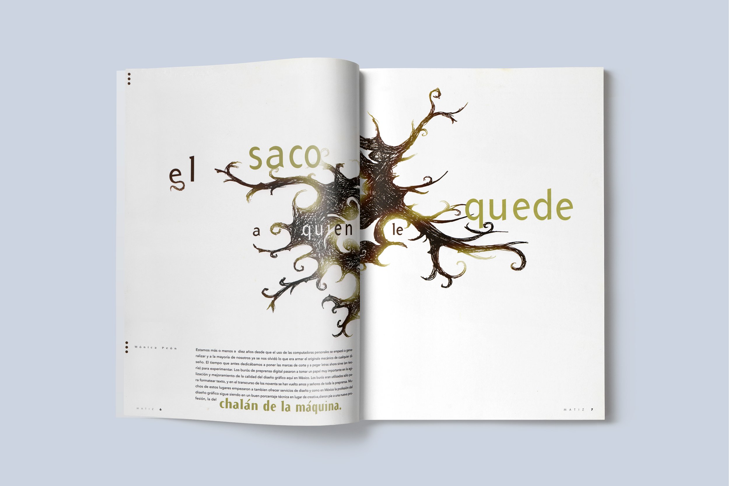
• EL SACO A QUIEN LE QUEDE Real y crítica reflexión de la diseñadora Mónica Peón a el pobre desempeño y resultados del modelo de formación educativa por parte de las universidades de Diseño en México y el porqué de su evolución tan lenta. • THE BAG TO WHOM IT LEFT Real and critical reflection of the designer Mónica Peón on the poor performance and results of the educational training model by the Design universities in Mexico and the reason for its slow evolution.

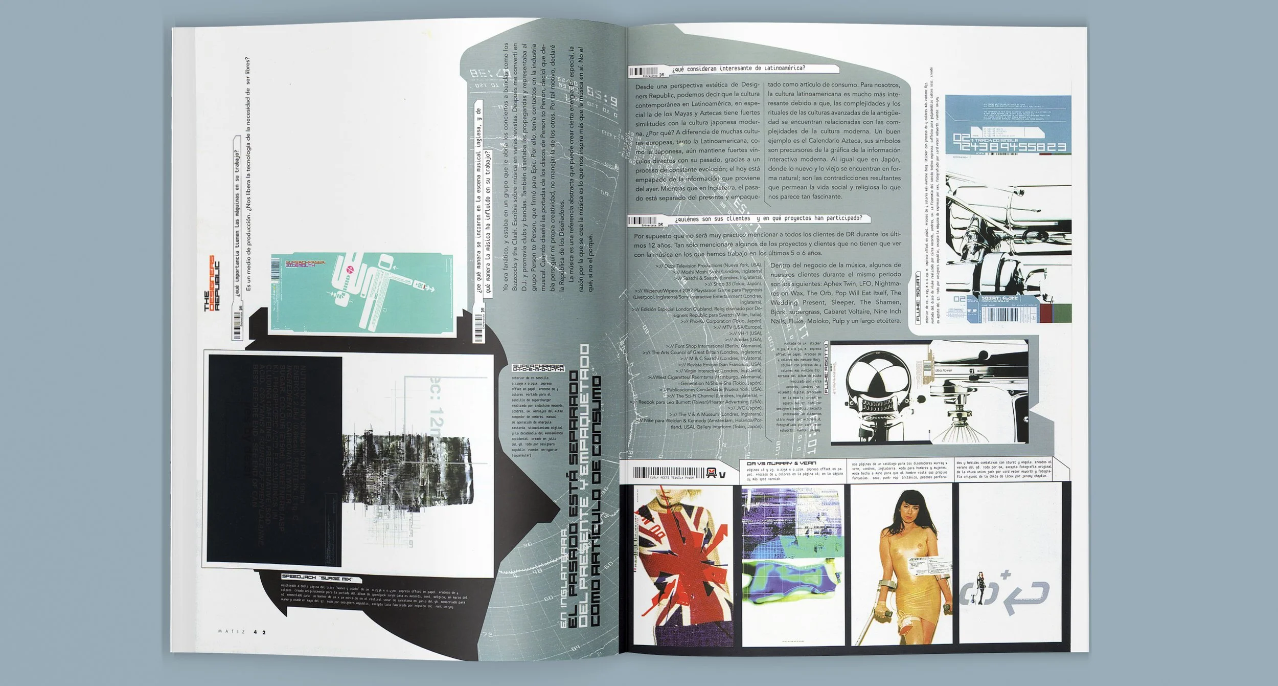
• THE DESIGNERS REPUBLIC Entrevista que tuve la oportunidad de realizar al estudio londinense The Designers Republic. Artículo en el que aproveche para crear una tipografía alusiva al texto. La experimentación siempre como búsqueda. "Las tiendas departamentales son nuestras nuevas catedrales". • THE DESIGNERS REPUBLIC Interview that I had the opportunity to do with the London studio The Designers Republic. Article in which I take the opportunity to create a typography alluding to the text. Experimentation always as a search. "Department stores are our new cathedrals".

• PLAZM La mesa de luz del despacho donde diseñábamos la revista rayada por el paso de los cutters, letras y pistola de plástico compradas en el mercado dan el ambiente perfecto para hablar de la revista especializada en tipografía experimental Plazm. • PLAZM MAGAZINE The light table in the office where we designed the magazine, scratched by the passage of cutters, letters and a plastic gun bought in the market, gives the perfect environment to talk about the magazine specialized in experimental typography Plazm.
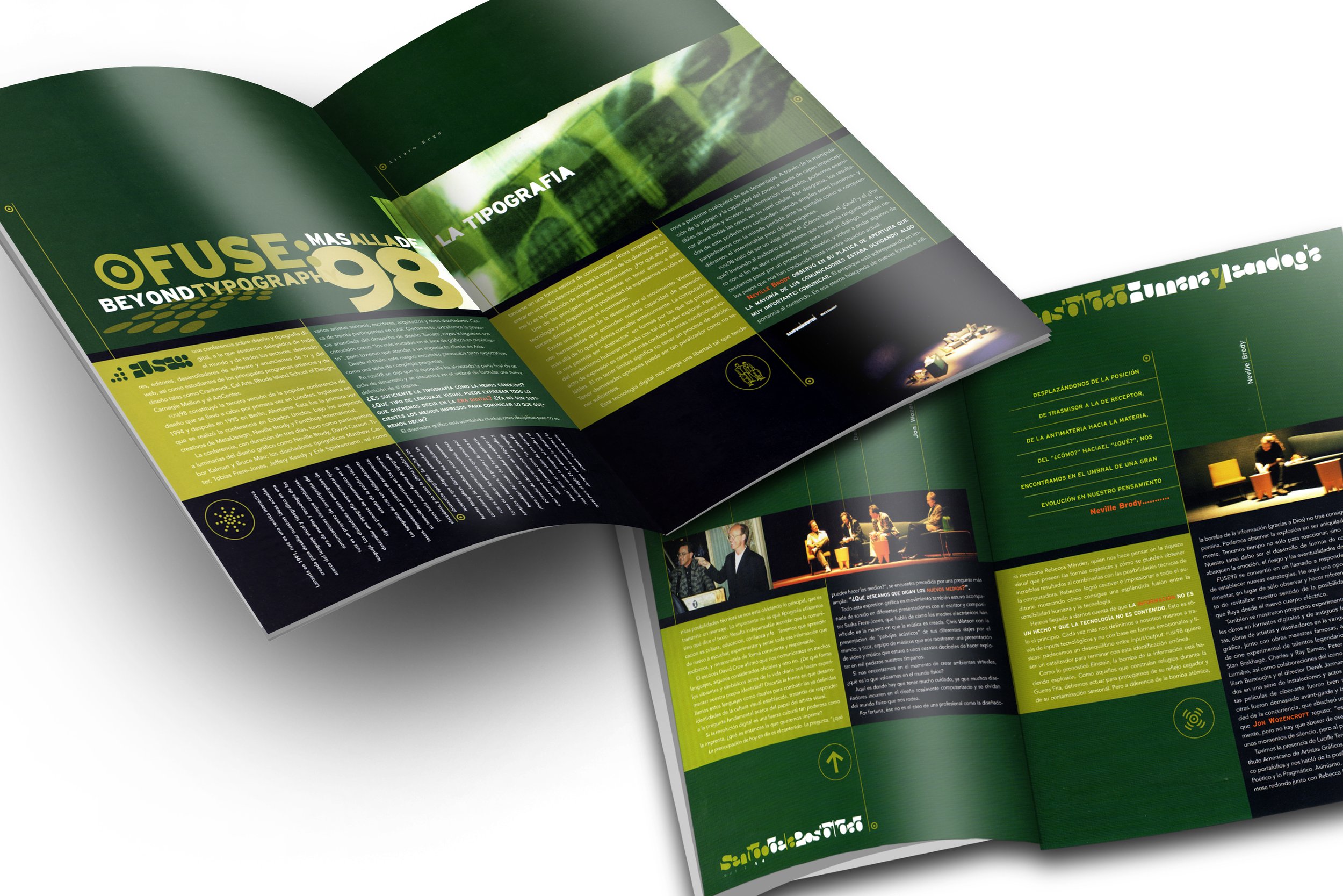
• FUSE '98: Beyond typography - San Francisco, 27, 28, 29 May 1998 Reportaje del célebre evento mundial FUSE que reunió a los mejores tipográfos digitales del mundo. • FUSE '98: Beyond typography - San Francisco, 27, 28, 29 May 1998 Report of the famous FUSE world event that brought together the best digital typographers of the world.

• NOSTALGIA Una reflexión de Gabriel Sama sobre el posible movimiento visual retro en México. Trate de rescatar a íconos como Sara García del Chocolate Abuelita o a Cepillín. • NOSTALGIA A reflection by Gabriel Sama on the possible retro visual movement in Mexico. Try to rescue icons like Sara García from Chocolate Abuelita or Cepillín Clown.
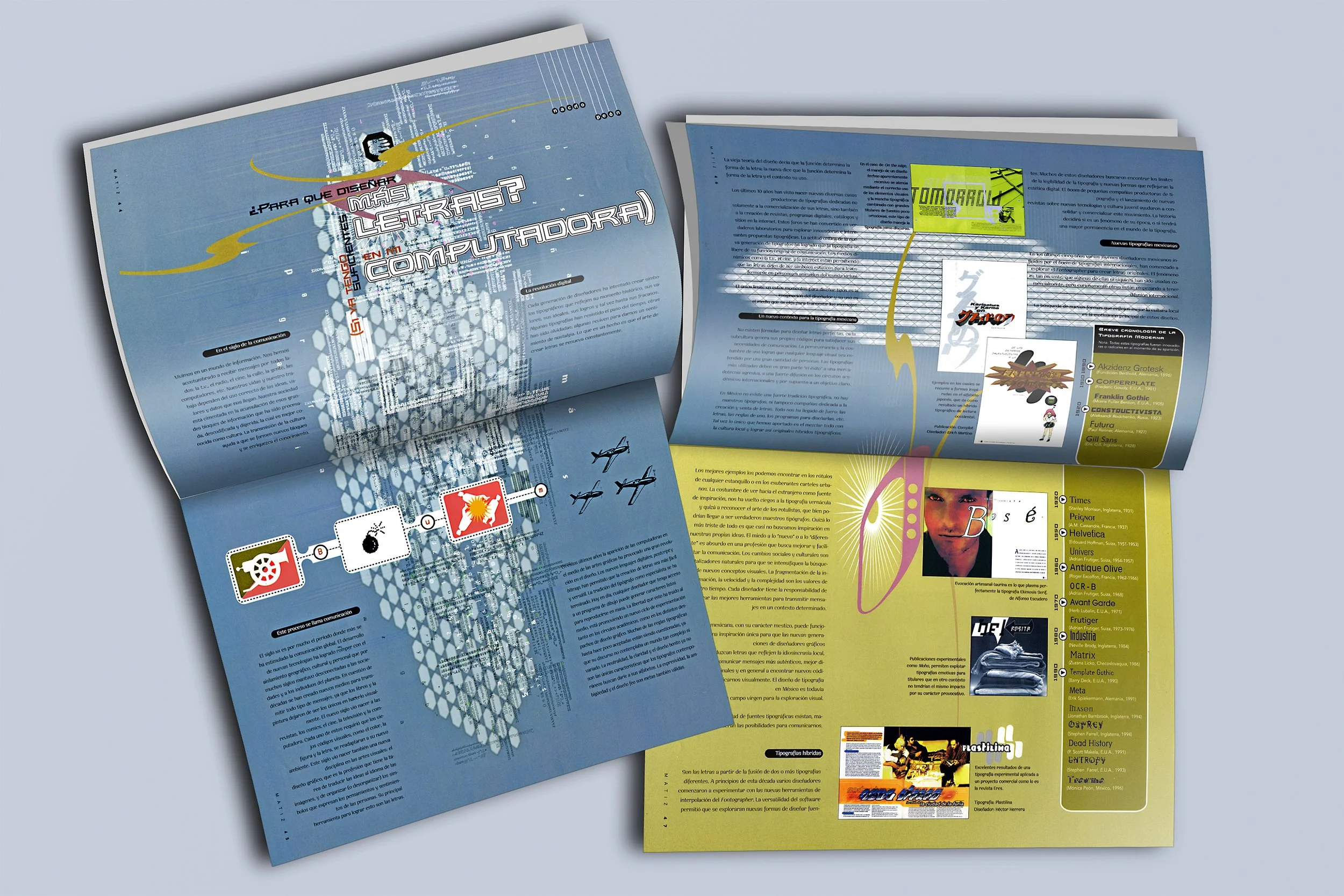
• ¿PARA QUE QUIERO MÁS TIPOGRAFÍAS EN MI COMPUTADORA? Artículo de Nacho Peón sobre la importancia de la tipografía como expresión cultural y como cada generación de diseñadores ha intentado crear símbolos tipográficos que reflejen su momento histórico. • WHY DO I WANT MORE TYPOGRAPHIES ON MY COMPUTER? Article by Nacho Peón about the importance of typography as a cultural expression and how each generation of designers has tried to create typographic symbols that reflect their historical moment.

• ME COMPANY Entrevista realizada por el íconico maestro Marco Patiño con el estudio Londinense Me Company y su fértil labor en el campo musical. • ME COMPANY Interview conducted by the iconic master Marco Patiño with the London studio Me Company and his fertile work in the musical field.

• HEROES DEL DISEÑO. Peripecias y malabares del recién egresado de la carrera de Diseño. Interpresentación personal utilizando monografías de papelerías en las que trate de mostrar a un estudiante que egresa, toca puertas y termina trabajando bajo un checador de salida con la frente en alto y visualizando el éxito y reconocimiento en su labor. • DESIGN HEROES. Adventures and juggling of a recent graduate of a Design degree. Personal interpretation using stationery monographs in which I try to show a student who graduates, knocks on doors and ends up working under an exit timer with his head held high and visualizing the success and recognition of his work.

• 135 PIXELES POR SEGUNDO Artículo sobre la creciente y rica oferta gráfica de arte en portadas de la escena musical eléctronica en el año 2000 • 135 PIXELS PER SECOND Article about the growing and rich graphic offer of art on covers in the electronic music scene in the year 2000

• Derecha: ¿QUITAR O PONER?, EL DILEMA DE LO SIMPLE Y LO COMPLEJO Artículo de Gabriel Martine Meave sobre que tan cargado visualmente debe ser un diseño. Mi conclusión: una pirinola que indica "Todos ponen". * Right: REMOVE OR PUT?, THE DILEMMA OF THE SIMPLE AND THE COMPLEX Article by Gabriel Martine Meave on how visually charged a design should be. My conclusion: a spinning top that indicates "Everyone plays."
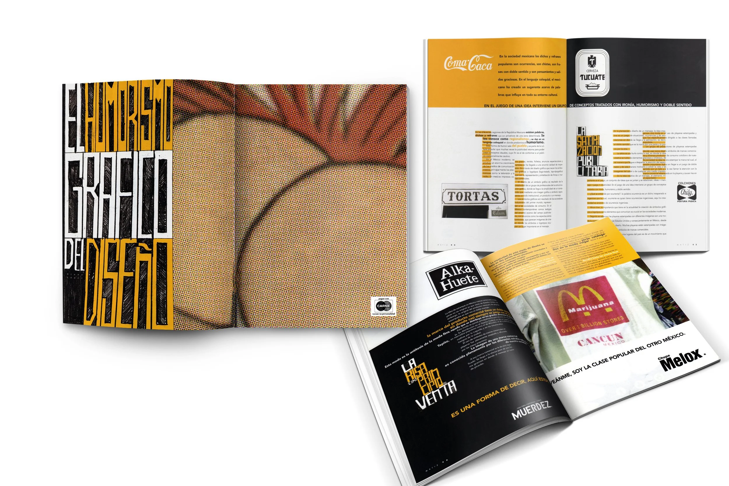
• EL HUMORISMO GRÁFICO DEL DISEÑO. El mexicano adapta marcas comerciales a su contexto jugando con el doble sentido. Para la entrada de este artículo escrito por Bruno López, diseñe un spread en el que utilize un encuadre de historietas populares de bolsillo en el que se mostraba el trasero en caricatura de una chica. Este iba acompañado del lado inferior derecho con una pequeña leyenda sátira del logo de CARNET, que en este caso decía: "Pague con Carne" • THE GRAPHIC HUMORISM OF THE DESIGN. The Mexican adapts trademarks to his context by playing with double meanings. For the entry of this article written by Bruno López, I designed a spread in which I used a frame from popular pocket comics in which the butt of a cartoon girl was shown. This was accompanied on the lower right side with a small legend satirizing the CARNET logo, which in this case said: "Pay with meat"

Entrevista a el ilustrador Julio carrasco

T-Shirt conmemorativa para el aniversario de la revista. •Commemorative T-Shirt for the magazine's anniversary.

Anuncio Matiz dentro de la revista, súper Matiz rescatando a los recién egresados de las revistas que solo buscaban su dinero, como la extinta MX o la a! Diseño. Derecha bajo: Cupón de suscripción Matiz advertisement inside the magazine, super Matiz rescuing the recent graduates of the magazines that were only looking for their money, like the extinct MX or a! Diseño magazines. Right below: Subscription coupon.

• Izquierda: Hablando al chile, luchador haciendo la pose del beso pipope. Póster para conferencias Matiz en AIGA Los Angeles y San Francisco. • Derecha: Póster para conferencias Matiz en ICOGRADA, Australia. • Left: Poster for Matiz conferences at AIGA Los Angeles and San Francisco. • Right: Matiz conference poster at ICOGRADA, Australia.

Algunos ejemplos de mis primeros proyectos multimedia. Acercamiento a la animación en el flash 1.0 y 2.0
Mi primera animación
Una tarde de sábado estando en casa quise hacer una animación de un personaje, y que mejor lugar para ponerlo que en la pagina de la revista a la que estaba a cargo.
Fué un pretexto para experimentar y divertirme. La sorpresa fué que el director de On-Air Promos de MTV Miami Manolo Alvarez llamó a la revista para saber quien lo había hecho. Me termino pidiendo un corto con este personaje que se estreno en la entrega de premios MTV del año 2000.
My first animation
One Saturday afternoon while at home I wanted to make an animation of a character, and what better place to put it than on the page of the magazine I was in charge of.
It was an excuse to experiment and have fun. The surprise was that MTV Miami's On-Air Promos director Manolo Alvarez called the magazine to find out who had done it. He ended up asking me for a short film of this character to premiere at the 2000 MTV Awards.
